Choosing the Perfect Area Rug

    Although a grouping of furniture may suggest a use for a space, a rug is what grounds it, pulling all the elements together. It’s an additional floor, and creates a room-within-a-room.  Adding an area rug turns a sofa and two chairs into an inviting place to sit. Depending on its colors, it can also visually knit the space together, providing coherence or a needed punch of color. And if it is a hand knotted rug, it brings a range of colors, as well as texture and dimension that is unequalled in mass-produced rugs. A handmade rug is a work of art for the floor.

    My first stop, and usually my last, when looking for gorgeous rugs is Harry King Rug and Home in Easthampton, MA. The owner, Jared Quinn, has an encyclopedic knowledge and a real love of hand knotted rugs, and is more than willing to explain what characterizes a particular rug, how it fits into the tradition of rug making, and what factors influence its cost.

    I enjoy going there because Jared puts visitors immediately at ease. Don’t know a thing about handmade rugs? He’s happy to tell you whatever you want to know. If you are a connoisseur, you’ll appreciate the breadth of the offerings and end up having a fascinating chat about the current state of the rug industry.

    I was interested in finding a smaller rug to delineate the seating area in my sunroom. For this project something in the 5 x 7’ to 6 x 9’ range would be ideal. Half of my sunroom consists of a small dining table, and the other half is for reading and lounging. It’s a small area, and I wanted something to fill in the space between the chairs and the sofa, not to cover the entire floor. My sunroom has always had a seating area, but I hesitated to cover its beautiful brick floor with a rug. In the summer, that worked well: the brick stays cool in even the warmest temperatures and adds a pleasant outdoor feeling to the room. But in the winter, I found myself not using the room as often. It wasn’t just the cold floor, it was the cold feeling. Having a fair amount of furniture in relatively close quarters made it important to differentiate the two areas. 

    Flipping through rugs ( Jared flipping, me watching) is a good way to get a fresh perspective, and to consider a variety of styles and colors. I love the surprise of this: suddenly a combination of colors or a certain style will appear that I never would have thought of, and that just might be the right choice. After going through each size category twice, I settled on four rugs I thought might fill the bill. Because there is a lot going on visually in the room, I was looking for rugs that would not be the main attraction, but an interesting backdrop for the colors and patterns already there.

    The best way to see if a rug will work is to try it in your own home. The light is different from that of a rug gallery, so colors will look different as well. And you may find that there are elements in the room that you overlooked when thinking about what would work best in your space. Here is what I discovered.

Rug One: Gorgeous Green

    This is the rug I was immediately drawn to when I first saw it. It is a Gabbeh from India, and is very thick and luxurious. There are several color variations in the pile, even a hint of turquoise, which worked beautifully with the sofa. The first thing to consider is how the rug works in the room, and the second is how it works with adjoining spaces. I love this color. Although the chair on the left is not great with it, it’s good enough—not everything needs to match or the look is too forced. Or am I telling myself this because I overlooked the fact that the chair in the foreground has more than a little mauve and a golden green in the fabric? The wall color, sofa, and second chair are lovely with it.

    The thickness of the rug worked against it—next to the scale of the furniture, it seemed a bit heavy. Gabbehs tend to be informal rugs, and when I put it down on the floor, I saw that this room is a bit more formal than I had realized. And while it looked well with the rugs in the nearby dining room, it was less than lovely with the living room, which was also visible. But I do love that marvelous green color, and it blends beautifully with all the plants in the room.

Rug Two: Flowers and a More Refined Look

    This rug was a bit smaller than I would have liked, but in the case of rugs that are handmade and may well be one-of-a-kind, I think size is less important than the beauty of the rug. If it’s right I can make it work, by bringing the pieces of the grouping a bit closer together. This rug was very finely made, with incredible detail. Jared called it “the best of the best” from Afghanistan. It is beautiful, soft and pliable as a blanket, and it works surprisingly well with the furniture and the brick floor, but I don’t love it. It is also perhaps a bit too refined for the feeling I want in the space. Rugs have personalities, and it’s important to match the feeling of the rug to the feeling you are trying to create in the room. A rug like this is an investment: you have to love it, delight in it, adore looking at it. On to the next rug.

Rug Three: Too Much of a Good Thing

    This rug checks every box in the list of things I love. My favorite color, orange, is beautifully represented in several shades; the turquoise center works very well with the sofa and chairs. This Gabbeh has a happy, cheerful feeling that suits the room. It is, unfortunately, too overwhelming. The two different stripes of the chairs pale next to it; the pillows on the sofa suddenly look chaotic: it’s too much rug. The blue rectangle is not centered, and the coffee table obscures most, but not all, of it. In a small space with a coffee table, a medallion or center design does not work well. It would be better used in a front hall or where no furniture will be placed on the center of the rug.

    It is easy to become distracted by a favorite color, or an appealing look or feel. That’s important, but too many appealing pieces can result in a room so filled with interesting elements you don’t know where to look: there is no focus. Not everyone can be a star: in the world of decorating, supporting roles are crucial to establish balance, and to give the eye a chance to rest. Still, it’s a great rug. Heavy as it is, I drag it around the house, hoping to find a place for it because it is so very appealing, but it’s no use.

Rug Four: Surprise!

    This is a rug that I thought would be worth trying, but I didn’t love it at the store. It is also a Gabbeh, but it is much less thick and finer than the others, a bit more refined, but still offering plenty of texture and variation of color. It wasn’t until I placed it in the room that I was sure it was the right choice. The personality of this rug seems shy: it doesn’t cry out for attention, but it has quite a bit to say. It supports the grouping without overwhelming it. There are various shades of two colors in this rug: a light creamy gold, with the barest touch of green in it, and a mid blue with the barest touch of turquoise. The design has a lot of rhythm: the stripes are a variety of widths and shades. The creamy gold was a wonderful team player: it looked lovely from both the living and dining rooms, and it worked very well with the chair in the forefront of the photo. The blue was perfect with everything. The colors of this rug are not a match with any element in the room; rather, they work in harmony so that everything is pulled together. If this room was filled with very neutral furniture, with a few colors in pillows or other accessories, a rug with stronger color might work very well, providing the zip the space would need. But here there was plenty of zip. What was needed was modulation and harmony. Like friends who become more beautiful the longer you know them, this rug looked better and better to me until I wondered how I had ever overlooked its obvious charm.

    I often suggest to friends and clients the mantra “ Not this time, not this house” to help understand that a piece, though very appealing, might not work in this particular context. We are all drawn to a number of disparate decorative directions. In order to create a space that has depth, character, and focus, some directions need to be eliminated. The green rug, especially, was a very close contender, but it would have taken the space in a different direction, and I was happy with what I had. My second piece of advice is often to buy a piece of clothing in the color you suddenly feel you can’t live without, rather than committing to a major decorative purchase in that shade. Let me know if you find anything amazing in green.

Lighten Up: Make Any Room Lighter and Brighter

     Maybe it was a yearning for spring, or just a wish for a change of pace, but last year I found myself feeling like my living room was too dark, too rich, too heavy. It needed more light, both literally, in terms of letting in more daylight, and figuratively: the room’s atmosphere needed lightening up. I wanted to keep the warmth, but lose the heaviness.

The original living room

     The old room was warm and filled with atmosphere. It suited the house, which was built in 1914 in a combination of Craftsman and Colonial Revival styles. I thought it was just about perfect—until it wasn’t. One of the great things about decorating is the fact that it’s not rocket science or the cure for cancer. You’re allowed to change because our definition of comfort and style is ever evolving. For me, suddenly lightening up seems right. If you’re feeling in the mood to let the sun shine in, here are six strategies for transforming your space.

RECALIBRATE COLOR: TAKE IT DOWN A NOTCH

     Much as I adore color, I have to admit that intense, saturated color can gobble up light. Strong colors come into their own at night, but in the daylight can seem overwhelming. A soft backdrop allows other elements to emerge. When thinking about color, realize that walls, ceilings, and floors contribute to the overall color story, as does upholstery, art, and accessories.

     I decided to color the walls and the sofa in a soft, warm camel. This more neutral base increased the impact of the other, stronger colors. 

REDUCE CONTRAST: PAINT THE WALLS AND THE TRIM THE SAME COLOR

     When contemplating any decorating change, it’s essential to stand back and look objectively at the elements that define the space. In my room, there were two large archways, a great deal of window and crown molding, as well as several bookshelves and a wooden surround for the fireplace that went up to the ceiling. That left very little actual wall space. 

     The mid-range trim I had chosen years earlier enhanced the Arts and Crafts look I had been trying to encourage, but I began to see it impeded the flow of the space. In a room that is broken up by an overabundance of trim, painting the walls and trim the same color calms the space, and makes it look much more expansive. Choosing matte paint for the walls and an eggshell finish for the trim allows a bit of delineation between the two surfaces, but keeps the clean look.

RETHINK WINDOWS: LESS FABRIC, MORE SUN

     The most obvious issue way to let more light into a room is to cover less window glass. Curtains that are set back on either side of the window allow all of the window to remain visible. Roman shades that extend to the ceiling allow you to raise the shade higher, thus letting in more light, while still looking substantial. Mounting any window treatment at ceiling height also has the immediate effect of making the ceilings appear to be higher, which encourages a feeling of spaciousness.

The "new " living room with winter pillows

     My inside mounted romans in pumpkin silk covered half the window glass. If they were raised higher, the scale looked off—there was simply not enough fabric to balance the rather large windows and abundant trim; plus, the pumpkin color was bright enough to really stand out, which made the shades seem even smaller.

     The solution was to go to an outside mount, which stood up to the scale of the windows and furniture, but also allowed me to raise the shades considerably, literally letting more light into the room. I decided on one very large shade for a bank of three windows, which looked less choppy and provided a bit of a modern vibe. This time the fabric was much softer: Fabricut’s Shalini Silk,  a lovely, textural mix of gold and light redwood. Softening the color made the windows blend more easily with the walls, enhanced available light, and made the room look larger.

CLEAR THE AIR WITH SIMPLE SHAPES  

     While the lines of upholstery or other furniture do not directly influence the lightness or brightness of a room, simple, understated shapes allow the eye to travel easily through the space. 

     Not only was the strong color of my old sofa too intense, the dramatic sweep of the back looked overwrought, and the high arms and tight back were not terribly comfortable. I chose a Lee sofa I had ordered many times for clients. To me, it is the perfect piece: modern without looking hard-edged, meltingly comfortable but never sloppy, and not oversized. I wanted a neutral but not boring backdrop for the art in the room, as well as for a variety of pillows that change seasonally.

Summer pillows in original designs in patchwork silk

     I removed the octagonalend table with cutouts that stood next to one of the chairs, replacing it with a simpler choice on the other side of the chair. This change accomplished two functions: the busyness of the table was eliminated ( it looks terrific in my home office) and the increased space between the two chairs encourages a clear, unobstructed view of the room. The space now invites you to enter, rather than partially blocking the way.

WATCH OLD THINGS LOOK NEW AGAIN

     In the living room’s new, soft light, the Tibetan rug I had toyed with replacing came into its own. Probably because there was less visual distraction, the colors in the rug seemed more vivacious. Because there were so many other colors in the room, the rug had read only as green and gold. Suddenly, I saw a deep lavender, orange, a mid-range blue, and a camel that nearly matches the new sofa. 

     The objects on the bookshelves were rearranged, and many books given away. The new, pared-down objects seem to float on the shelves because they are no longer competing with the dark trim.

MAKE COLOR AND FORM COUNT

     A calmed down, more neutral room can easily slip into blandness. It’s important to keep a few elements that focus attention and energize the space. I kept my live edge coffee table. Its color blends more easily into the new room, but it still functions as a piece of sculpture. Colors from paintings in the room now set the color direction, and the pillows on the sofa reinforce it.  If you use landscapes, you can almost always count on green and blue as colors that you can echo in other elements. In this room, streaks of orange, purple and raspberry, in small quantities, enliven the atmosphere, playing off the soft camel backdrop. Ironically, if you use a warm, soft, sunlit base for walls and upholstery, you can step out with colors that you would never consider in a larger dose. And by juggling artwork and replacing a few pillows and accessories, you have a whole new story to tell. 

What You Need to Know to Survive Your Remodel

    Contemplating a major remodeling project is part Fantasy Island, part Castle of Doom. On Fantasy Island, anything is possible: a high endkitchen on a low end budget, walls that are magically not load-bearing and thus simple to move, a small bathroom with plenty of room for two sinks. While it’s easy to laugh at those initial assumptions, the first part of planning a project is in many ways the most creative and satisfying.

This window seat and garden serves as a transition between the master bedroom and bath. 

This window seat and garden serves as a transition between the master bedroom and bath. 

    After living with a less than lovely room for years, suddenly you have a chance to imagine what could be. It’s important at this point to think big and come up with as many ideas as you can. Plenty of your initial ideas will prove to be too expensive, or downright impossible because of the limitations of your home or your local building codes. But the value of letting your imagination run wild is that you often uncover the very things that will make your project unique, and bring you the most joy.

    Thinking about the functions you want the room to fill, rather than its conventional name, is one way to spark your imagination. Instead of kitchen, think room that encourages your teenagers to join the family. That may mean a deep counter with comfortable seating or an adjoining family room, even if there is room only for a sectional and a large tv. 

    If you want your partner to join you in food preparation, think a room with space for two people to work without bumping into each other. If you want to keep an eye on younger children as they do their homework, a banquette and an easy to clean pedestal table with a built-in charging station will fit the bill.

    Understanding what you really want the space to be results in rooms that fit you, rather than you force-fitting yourself into an unsuitable space.

    Unfortunately, you can’t live on Fantasy Island, so it’s time to move on to the Castle of Doom. This is where paralysis sets in: no matter the project, you are spending more—sometimes considerably more—than you had planned. Most people’s first reaction to the outflow of cash is: I can’t make a mistake! If they make a mistake, the money will be wasted. The decision process, which was so much fun in the imagination stage, now seems fraught with peril. I have two pieces of advice for the paralyzed: do not make decisions solely on the basis of cost, even when you feel you have opened the financial floodgates. The second is to understand that there are very few mistakes; rather, there are miscalculations that can be fixed.

    My theory of controlling costs is to spend money on doing the job correctly and paying extra for the things that will please you every day. Stick to the basics for the rest. If you are a serious cook, that may mean spending on a professional range and ventilation fan and saving money on simple, utilitarian lighting fixtures and an inexpensive backsplash. If for you preparing meals is a necessary evil, buy a good-looking stove without the bells and whistles and enjoy a beautiful stone countertop and gorgeous light fixtures. 

    The important thing is that nothing looks cheap, which makes you, and down the road, prospective buyers, question the integrity of the entire project. Many classic designs connote a feeling of quality. A plain white backslash with subway tiles from Home Depot looks classic, but is inexpensive. Simple light fixtures, a porcelain tile floor, plain but well designed appliances can all contribute to a feeling of permanence and quality. 

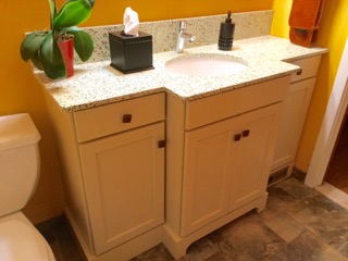
This custom vanity allows for storage without overwhelming the narrow room. 

This custom vanity allows for storage without overwhelming the narrow room. 

    Sometimes going with a completely custom piece can be the best solution in a difficult space. When remodeling a very small and narrow bathroom with no storage, I worked with clients to design a custom vanity that allows them to have drawers and cabinets on either side of the sink cabinet. That vanity is now the highlight of the bath. The counter was a splurge of colorful glass shards embedded in quartz, but the sink, faucet, tiles for the floor and the shower stall were all very reasonably priced. The custom vanity elevates the room in terms of style, but it radically adds to its function as well. 

    Whatever choices you make, do your research, measure three times, trust the advice of the professionals you have hired, consult your gut as well as your logic, make your decisions, and don’t look back. Once the space is finished, you can reassess and adjust. Most miscalculations involve aesthetics, rather than function. Your countertops are so busy they take over the room, or you made too many conservative choices, and now everything looks bland. 

    These aren’t disasters, and they are fixable. Take the overbearing counters. You chose that stone because you loved it, but you underestimated its impact. Let’s say it is a strong brownish gray with streaks of rust, which creates a feeling of movement. There are two ways to go: beef up the wall color to a warm paprika, on only one wall or all of them, to visually stand up to the intensity of the counter, or use a more neutral but still strong color like a moody gray with beige undertones that absorbs it. Use a strong pattern on windows and/or seat cushions that includes the paprika but adds a number of other colors, which will make it stand out less.

Details like this handmade pendant light bring personality and beauty to a neutral kitchen.

Details like this handmade pendant light bring personality and beauty to a neutral kitchen.

    Or, go in the opposite direction and make walls and fabrics a soft medium-toned neutral but use copper lighting fixtures or one other decorative element that relates to the counterto allow it to take center stage. This is a strategy professional use all the time: we do our best to fully imagine the space, but even if the plan is completely drawn out before construction, there are always adjustments to be made at the end of the project. Creating a room is a process full of discovery. 

    And though you may have to weather a few storms to get the space you want, focus on the big picture. When that’s right, the details will fall into place, and, if they don’t, they will be easily adjusted. Sometimes the shock of the new takes getting used to. Nothing is wrong—it’s just that your eye needs to adjust to new space, furnishings, and colors.

    Impossible as it is to believe, a month or two after your project is finished and your house is calm again, you just might miss the intensity and creativity of being immersed in a remodeling project. Luckily, there are always other rooms.

Art for the Kitchen: A Tale of Two Refrigerators

The first fridge

If you are like most people, almost every inch of wall space in your kitchen is dedicated to cabinets or appliances. In my kitchen, because there are four doorways, all essential, room to display art or ceramics is in short supply. Years ago, I saw a refrigerator with a panel consisting of maps that charted the owner’s travels; I quickly realized the fridge is a wonderful opportunity to display art.

    When we moved to our current home several years ago, I was lucky to find a fridge that accepted panels, but was a conventional counter depth size. I used a large Cinzano poster of two zebras leaping. The bottom of the poster did not quite cover the bottom freezer door, so I used a piece of poster board to add the extra length.

    The poster was cut into two pieces, then attached to foam board. Because of the size of the poster, we were forced to include the white border at the top of the image.

    That worked for awhile, until I got the urge to make the kitchen less carnival and more calm. This time I used a Rothko print. In spite of the size and color of the image, it projected a feeling of serenity. It also allowed me to play with a wider range of colors that were less intense in value.

First fridge, second look. This poster is still my favorite.

     Once again, the poster was not long enough, so a piece of coordinating poster board was added. This time I had the image laminated, then affixed to gator board, which is a stiffer backing than foam board. The lamination provided an extra layer of protection against spots and dirt.

    The Rothko poster set the tone for the color in the room, working beautifully with smaller pieces that fit on my very limited wall space. Intense, yet calming, it created the perfect atmosphere.

The new fridge, minus artwork. 

    But all good things come to an end. The refrigerator broke after 15 years, and that model had been discontinued. If I wanted a fridge that would accept a panel, I would have to go to Sub Zero or Thermador. Not only were these fridges at least triple the cost of my old Amana, they were too tall for the space, which would mean the fridge cabinet would need to be removed and placed higher on the wall, and the crown molding would also need to be removed and replaced.

    I could find units that fit the opening, but everything that fit entailed changing to a double door on top/freezer on the bottom style; they also did not accept decorative panels. After much research and debate, I decided on a Fisher Paykel fridge that fit exactly into the space and gave me a bit more interior room. But although the fridge fit in the space, the artwork no longer fit on the fridge. Enter the folks at Frigo Design, a New York State company that specializes in making custom frames for fridges and other appliances. They could make a frame for each of the three panels that would hold whatever artwork I found.

     Since I was starting from the beginning, rather than trying to fit something unconventional into an existing frame, I looked through the fabulous selection at New Era Portfolio, an online trade site that has a wide variety of interesting artwork by contemporary artists. I was able to customize the size, so that the print fit almost perfectly.  I felt strongly that because I now had to contend with two handles in the middle of my print, I wanted the art to be asymmetrical, so that it did not appear to be sliced in half. I also wanted an abstraction, so that the eye was not registering breaks in the image. The print I chose, by a contemporary artist, kept the same color scheme as the Rothko.

Finally finished! Note the different handles: the Frigo frame fits over the existing doors, which meant the original hardware had to be removed.

    Preparing the print to act as refrigerator panels was a challenge. Laminating can sometimes produce wrinkles which cannot be removed, and many print shops refuse to even try. Mike Kennedy, at J & M Imageworks (jm-imageworks.net) not only laminated the very large print flawlessly, he suggested di-bond, a more durable backing. This is important because the Frigo frame fits over the fridge, and once it is in place, the panels cannot be removed easily.

    This is not an inexpensive project, but even when adding the roughly $1000 additional cost of buying a frame, artwork, and then treating the artwork to stand up to everyday use was far less expensive than buying a built-in unit; plus, there was no need to alter the kitchen cabinetry.

  Was it worth it? Absolutely! I like my kitchens warm, with plenty of color. Transforming a huge expanse of stainless steel into a piece of art makes my kitchen unique, as well as cutting down on the inevitable clutter a magnetized surface encourages. The color makes me happy, and I feel somehow that I’ve outsmarted the system. Yes, I had to settle for a french door fridge, but as Frank Sinatra liked to say, “I did it my way.” If you’re interested in appliance frames, check out frigodesign.com

Handmade Home: Finding Unique Furnishings at the ACC Craft Show

Furniture by Blackwater Woodworks, LLC: http://www.blackwaterwoodworks.com/

    A few weeks ago, I travelled to Baltimore to attend the ACC Craft Show, the largest craft market in the country. The show is immense, and is divided into two shopping experiences: the first two days, Wednesday and Thursday, are devoted to the wholesale market—mostly owners of galleries and stores that specialize in handmade craft, with a few designers thrown in for good measure. 

    While I was browsing a fabulous array of glass, ceramics, and other home accessories, and sneaking a quick look at the jewelry and fashion as well, the second part of the show was being set up. On Friday morning that show combined forces with the vendors from the wholesale show to create a paradise of fantastic handmade objects and furnishings for the home. A large show like this draws craftspeople from all over the country. Just as most of us have identifiable accents but think we don’t, crafts from different parts of the country often have a different aesthetic. It’s a great chance to see things that are not shown in regional markets.

Glass by Lauren Cummings - (email

    The live edge low media stand shown here, as well as the wooden chair, were two of my favorite furniture designs. Purchasing a piece of furniture from a furniture maker costs about the same as high end mass-produced furniture, but you have something that is both unique and beautiful, as well as being crafted to the highest standards.

    These glass vessels by Pennsylvania artist Lauren Cummings were incredible, calling to mind a modern take on lusterware and the look of molten metal. They were so beautiful I couldn’t resist bringing one home for myself. 

Pottery by Peter Karner, of Boulder, Colorado - http://www.peterkarnerpottery.net/Home.html

    Ceramics are a personal favorite —I love the combination of utility and beauty, and the touchable quality of pottery. Glass is mainly a feast for the eyes, while pottery encourages you to touch. There were many fine ceramic artists at the show. My favorite was the work of Peter Karner of Denver, because his work seemed both very unusual and also of-the-moment. I can see his work in a mid-century Modern room, as well as an eclectic room filled with color and pattern. Moroccan style is all the rage this spring, and Karner’s work easily fits in with that aesthetic as well. Of course I bought a beautiful bowl, but lusted after many more of the pieces. 

    What can you expect to find when you attend a high quality craft show? Handmade rugs and floorcloths; pottery, including dinnerware; glass, both decorative and utilitarian —though not utilitarian looking! Textiles: wall hangings, quilts, pillows; furniture, both wood and upholstered; and many innovative pieces to hang on your walls. Handmade boxes, accessories, lighting. And that’s not even counting the jaw-dropping array of jewelry, clothing, and fashion accessories. There are no bargains at shows like this, but there is terrific value. The level of craftsmanship is high, and the point of view is always singular. I think of handcrafted pieces as examples of individual style that are beyond mere fashion. Fashion lasts for a season or two: style lasts forever.

    Another perk of going to a craft show like this is the opportunity to talk with the artists about their work. You learn how the piece is made in technical terms, and also learn the inspiration behind it. 

    To best understand the beauty of craft and the impact it can bring to your home, visit a show. My favorites are Craft Boston; Paradise City; all American Craft Council shows, and Artrider shows. Small shows like Celebrate West Hartford have some interesting finds as well.   

    Centuries ago, the hand of the maker was always a part of the goods with which we furnished our lives. There is something incredibly personal about using or wearing an object that someone at the top of his or her craft has made. Fine crafts bring lasting beauty to your home; they also make a world that can seem impersonal feel a little bit warmer.

Enchanting Objects

    These are photos of a truckload of pillows—part of a joyful array ordered by a favorite client to complement the furnishings in her newly remodeled home. Pillows, intriguing or beautiful objects, pottery, flowers are often grouped under the general heading of accessories, but they shouldn’t be. Think of an accessory to a crime: a sort of criminal hanger-on, not terribly important, but culpable all the same.  Decorative accessories are often thought of this way: an afterthought, or “fluff,” that appears after the main work of creating the room is done.

    Nothing could be farther from the truth. Accessories change your room from just any well-appointed room into your room. Accessories are what make the difference between room settings on a furniture showroom floor and the home of a unique individual. Ideally, the pillows and objects used could belong only to that individual—because no one else would put that combination together.

    Accessories bring soul into the room: colors that delight, a soft place to rest your back, objects to touch or to delight the eye. They establish an undercurrent of warmth and meaning that infuses the room and make it more than a collection of upholstery and case goods.

    Like a special seasoning that makes all of the flavors in a dish sing, every room needs items that unite the colors used in the major pieces. When you are blending a number of different colors in a room, it’s good to be able to reiterate each color a few times. Accessories can be the bridge between a variety of colors, the “secret spice” that allows all of them to live in harmony.

    If your room is relatively neutral,  a shot of color from a vase, or the shock of an unexpected color on a pillow’s welt cord can extend the impact of the room. Another friend of the neutral palette is texture. I love having objects that tempt people to touch, or to play with them. A small tray of printer’s letters and illustrations is fascinating to look at, and fun to rearrange. Artifacts of any kind are tempting: a collection of rocks, small boxes, paperweights, crystals, acorns, pieces of bark, pieces of beach glass: whatever invites interest and encourages touch.

    Enchanting objects are not afterthoughts. They are usually not found in discount stores or chains. ( Remember the partthe part about rooms being individual?) They need to be snapped up when you see them. To commit to interesting objects, you need to have faith in yourself and your own taste. If you find something fantastic, don’t worry about where it will be placed in your home. If it’s great, you will find a place for it. I have never regretted bringing home something I honestly loved. I have regretted NOT buying something I loved and knew I would never see again. I’ve also regretted vacation purchases ( it’s so easy to fall in love with something that reflects a tropical climate, and attempt to bring it home to New England ) as well as objects bought because I needed something for a particular event.

    Enchanting objects are found through a mixture of serendipity, discipline, and vision. Look everywhere, make sure it makes your heart sing, be bold and go for it.

Vacation Inspiration: Bringing Great Ideas Home

August is  almost universal vacation month. In honor of vacation it’s time to celebrate all the ways travel can reinvigorate life—and not only when we are away from home. What I love best about travel is how it—a vision that I can bring back home.

A bench in Parc Guell

On a trip to Spain, I visited Gaudi’s Parc Guell in Barcelona. The fabulous and unconventional tile work played out on such a large scale is shocking, exuberant, and mesmerizing. It is difficult to believe the park was constructed in the early 1900’s—it reminds me of the explosion of color in the 1960’s, when psychedelia influenced both color and form.  Gaudi  reminds me that there are always new color combinations. You can put murky colors next to bright, use texture to add another element to a wild mix of colors, and, most of all, enjoy riotous color without making an immediate value judgement of whether it “works” or not. Just enjoying is the point.

City Hall, Santa Barbara

The middle photo, which was taken at City Hall in Santa Barbara, CA, is a happy riot of color, but in a completely different way. Here the tile shapes are square, and the design is more subdued, but there is still plenty of excitement. The black and white diagonal lines add spice to the circular patterns of the rest of the tile. It’s a pleasant sort of tension that makes me see all of the elements separately: the arches at the top of the wall, the plant growing up the middle, the inset of flowers on the diagonal lines, and then look again and see a beautifully balanced whole. It is playful and calming at once.

On a trip down the California coast, I saw this fountain, from the Alcazar Gardens in Balboa Park, San Diego. I love its star shape repeated over and over, in so many different ways.  It was very difficult to just stand and admire, without hopping in! It’s a good lesson that design can be lighthearted without being whimsical and inspiring without being serious. 

Balboa Park, San Diego

What all of these enchanting places have in common—besides the fact that they all feature ceramic tile, a personal passion—is that they offer instructive decorating lessons.  Here is what I learned: be bold and inventive with color. Don’t be afraid to throw an unexpected element into a design, like a diagonal line or something roughly textured next to something smooth. The sound of water is both soothing and uplifting. It can also block out less desirable sounds, such as traffic. Even the simplest fountains look and sound great. Why not take that a step farther and build an unusual shape?

One way to be bold with color is to gather a range of colors together and play. My favorite way to do this is to use color chips from a paint store, cut up. Put some surprising combinations together; use a color you would normally never consider with a few you like and see what happens. Another way to enlarge your vision of color is to look at paintings in museums, in books, or in postcards. I collect postcards of paintings I particularly like when I visit museums. Not only are they fun to display on a tiny easel or two, they are wonderful guides to color possibilities.

To make sure your rooms are lively, or even just that the pillows on your sofa are intriguing, throw in a curve if there are many square or rectangular shapes. A round table in the midst of a square space brings balance and grace to the room. Put a bold stripe next to a splashy print. Use arches to soften a wall.

Wherever you go, enjoy the way your perspective shifts when you’re not at home, and it’s not business as usual.  I’ve found many wonderful objects to bring home from my travels, but the best souvenirs are the ideas brought back and adapted to make your home your own kind of fabulous.


Finding True Love at Summer Art Shows

The summer's abundance of art and craft shows is a great opportunity to find interesting, original art that is very well-priced. It's a chance to stroll around on a sunny day, seeing the work of many artists, without the pressure or the rarefied atmosphere that can sometimes be part of the gallery experience. Whenever I visit these shows, I notice people lingering over paintings or prints, clearly undecided. Is there something better in the next booth? How can they be sure of the quality or value of the piece? Will other people like it?

I bought this monoprint at Paradise City years ago. 

I bought this monoprint at Paradise City years ago. 

First things first. Who cares if other people like it? If everyone liked it, it would have to be an impossibly bland image. The first and only rule in buying art is to please yourself. There is no reliable way to affix monetary value to art. The market may value one artist highly and ignore another, only to reverse that opinion ten years later. So there's no sense buying art as an investment. If you are drawn to a painting, and consider it "good," that is the main thing that should influence you.

How to know if something is "good", or if your interest is an authentic feeling, rather than a passing fancy? In other words, what, exactly, is art? My quick definition of art is a piece that allows you to see the world in a new way. It is a small visual revelation, or revolution, really, since it upsets the accepted order of things.

Another way to define art is to decide what it's not. It's not nostalgia, or merely decoration, or something that makes you feel completely comfortable. It is more than that: an image you can't forget, that brings real delight every time you look at it. Because it is beautiful, but also because it has allowed your own vision to expand.

This is an oil by R. Michael Carr. I found it at the Virtu Art Show in Westerly, RI

This is an oil by R. Michael Carr. I found it at the Virtu Art Show in Westerly, RI

So there you are, wandering from booth to booth, until something catches your eye. You walk by, then return. When you take a closer look, the image becomes even more interesting. It's time to fall in love-- judiciously.

When I am standing in front of a painting that arrests my attention, I try to determine if I simply like it--or if I can't live without it. Think of it as the difference between one date and a marriage. Make sure it's a piece with staying power.

Walk away briefly, and come back to the piece a time or two more. This is not to make you look ridiculous-- it is a good way to surprise your eye. Do you notice something new, or have a deeper appreciation of it, each time? Art, as opposed to a merely pleasing image, invites you to look closely, to get lost in the world of the painting. For me, looking at a captivating painting is like taking a little trip into the realm of the color, image, composition, and vision of the painting, and emerging a bit dazed, but refreshed, and changed for the better.

Another of R. Michael Carr's paintings, this time from the Mystic Art Show

Another of R. Michael Carr's paintings, this time from the Mystic Art Show

Don't worry about the size of the piece, and don't worry about where you will put it. You will figure that out. Most people are remarkably consistent in their tastes-- you will probably see all kinds of connections to other objects you like when you bring it home.

If you are asking yourself if there might be something better in another booth, you're not sure enough to buy. It may be gone when you return, but if you check out the entire show and come back to find someone else has snapped it up, talk to the artist. He/ she may very well have something like it that is not on display.

Speaking of the artist, outdoor shows are a rare opportunity to talk with the person who created the art. Asking him/ her about the painting can result in a deeper appreciation and understanding of the piece. Even if you are not in the market to buy that day, it's always a treat for an artist who works alone to hear that you like the work.

If you've come this far, don't second-guess yourself! Grab it before someone else does. Buying art means looking deeply, taking a chance and trusting your own perceptions. For most of us, that's not easy, but the rewards are more than worth the risk.